You're probably doing what most business owners do when they search for an example of web page design. You open a dozen agency sites, admire the slick visuals, then close the tabs still unsure what would help your own website generate more enquiries or sales.
That's the problem with most design inspiration. It focuses on looks, not results. In the UK, web design now sits at the centre of how people choose and buy, not at the edges. UK internet access reached 99% of households in 2024, and 20% of all UK retail sales happened online, according to this UK web design statistics summary citing the ONS. Your website isn't a brochure anymore. It's often the first sales conversation.
So let's skip the gallery fluff. Instead of generic “beautiful website” examples, this guide looks at the websites of UK web design agencies themselves. These are the firms selling digital credibility for a living, so their own pages should show what works. You'll see how they handle hierarchy, proof, calls to action, trust signals, and platform choices. Beyond that, you'll get practical lessons you can steal for your own homepage, service pages, and landing pages.
Table of Contents
- 1. BPE Digital
- 2. KOTA
- 3. Propeller
- 4. Hallam
- 5. Ridgeway
- 6. Fortnight Studio
- 7. ViDesigns
- 7-Agency Web Design Comparison
- Your Next Steps Turning Inspiration into Action
1. BPE Digital
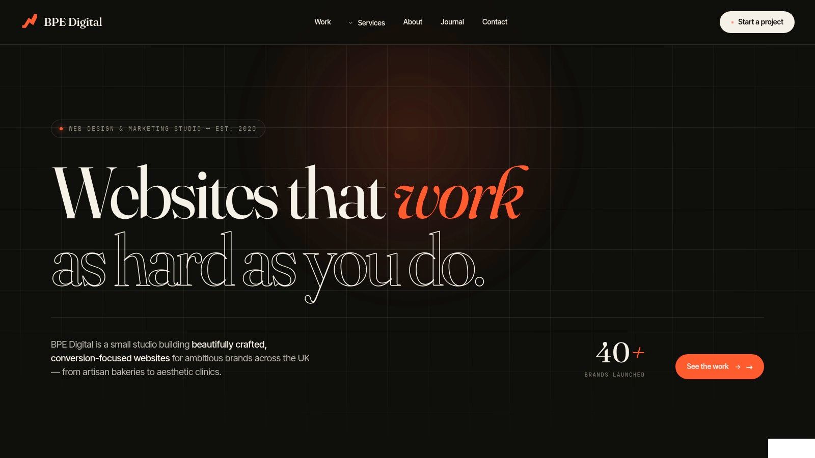
A business owner lands on this homepage with one question in mind. Will this agency help me get more enquiries, sales, and traction, or am I about to sit through another design pitch? BPE Digital answers that question fast, and that is why it earns its place on this list.
This is the strongest example here of an agency designing its own site around commercial intent. That matters. If a web design agency cannot sell its own services clearly, you should be sceptical about what it will do for yours.
What their homepage gets right
BPE gets to the point. The headline, service structure, and calls to action work together to tell a busy buyer three things quickly: what they do, who they help, and what happens next. That reduces friction, keeps the right visitors on the page, and improves the odds of an enquiry.
The smart part is the hierarchy. Visual polish helps, but structure does the heavy lifting. You are not forced to decode vague agency language or hunt through clever layouts to find the offer. For UK service businesses, that is the lesson to copy. Clarity gets more leads than decoration.
Their positioning also reflects how buyers think. A clinic owner, trades firm, hotel group, or local service company is rarely shopping for "web design" in isolation. They want better visibility, stronger conversion, and a site that supports marketing after launch. BPE presents design as part of a wider growth job, which makes the offer more credible and easier to buy.
Practical rule: Your homepage should explain the offer before the visitor starts scrolling for answers.
There is another point worth copying. BPE signals control. No-template builds, accessible code, and no lock-in contracts give buyers confidence because they reduce future risk. If you want to change supplier, add landing pages, or improve campaigns later, you need a website you can use, not one tied to a closed setup.
What to copy on your own site
Do not copy the styling. Copy the commercial discipline behind it.
- Lead with the outcome: Say what improves for the client. More bookings, more quote requests, stronger local search visibility, better conversion.
- Group services in plain English: Buyers should understand your offer in seconds.
- Push one primary action: Quote request, consultation, or discovery call. Pick one and make it obvious.
- Show proof early: Trust marks, results, and relevant examples belong near the top, where they reduce doubt.
Their website design service page is useful for studying how they expand the offer without losing clarity. If you want a practical example of expectation-setting, their guide on how long it takes to build a website in the UK also shows the same strength. Clear process, plain language, no waffle.
That process language matters more than many businesses realise. "Discover, Design, Build, Grow" works because it reassures the buyer that there is a plan after the homepage impresses them. Good agency sites do not just show taste. They show how the engagement will work, which lowers perceived risk and helps turn interest into contact.
The trade-off is straightforward. Senior-led studios like this usually have limited capacity and they are unlikely to compete on price. For a business that wants a bespoke site built to generate leads and support long-term growth, that is often a sensible trade.
2. KOTA
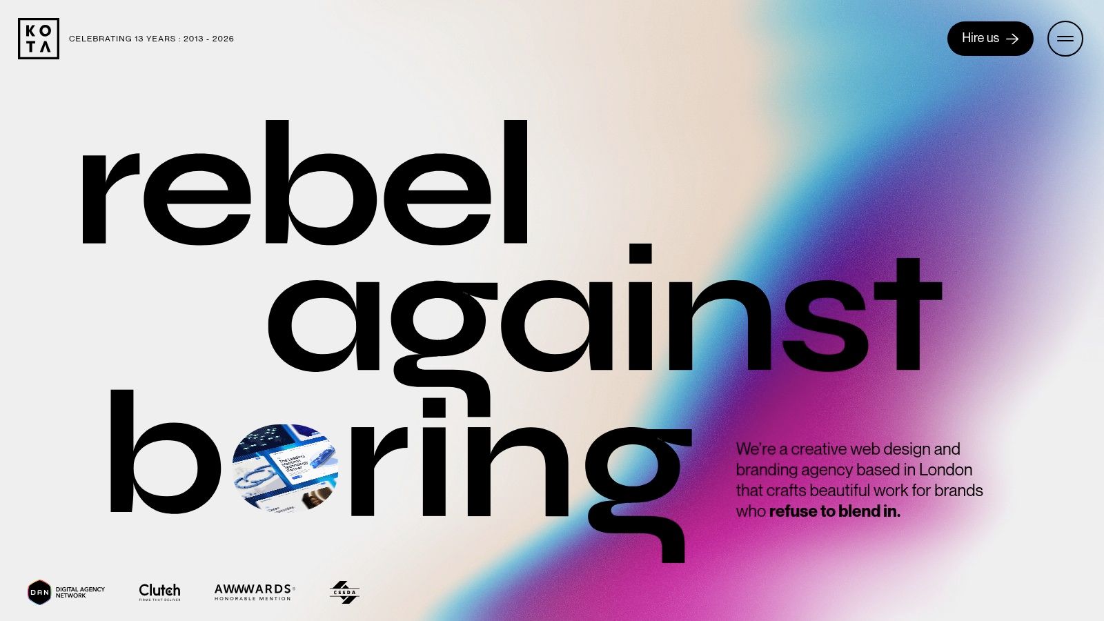
KOTA shows what happens when a creative agency understands that distinctive design still needs structure. Their site has personality. Motion, layout shifts, and visual craft are part of the pitch. But underneath that, the page still moves you through a controlled journey.
Here, many businesses get confused. They see an agency site like KOTA's and think the lesson is “make it more animated”. It isn't. The lesson is to use creative direction to reinforce the brand, not distract from the path to enquiry.
Where creative direction helps
KOTA's strongest pages tend to pair visual confidence with clear case-study storytelling. That matters because buyers rarely choose an agency on aesthetics alone. They want to see thinking. They want to know what changed, why it changed, and what outcome followed.
That aligns with practical guidance on case studies. Strong web design case studies work best when they show before-and-after context, clear design decisions, and visible results near the top, as outlined in Webflow's guidance on writing better case studies. If you run a service business, that same principle applies to your own website. Show the result first, then explain the process.
Good motion helps users focus. Bad motion makes them work harder.
KOTA is a good benchmark if your brand needs to stand out in a crowded sector. Fashion, lifestyle, luxury, premium hospitality, and ambitious B2B brands can benefit from a site that feels distinct. But there's a catch. Heavier visual craft needs discipline on performance and mobile behaviour.
If you're deciding what stack suits that kind of ambition, this guide on WordPress vs Shopify vs Webflow in 2026 is useful because platform choice affects design freedom, editing control, and long-term flexibility.
KOTA's main strength is brand presence. Its main risk is that some businesses copy the style without copying the strategy. A local service firm doesn't need cinematic transitions. It needs clear proof, a visible CTA, and friction-free contact.
3. Propeller
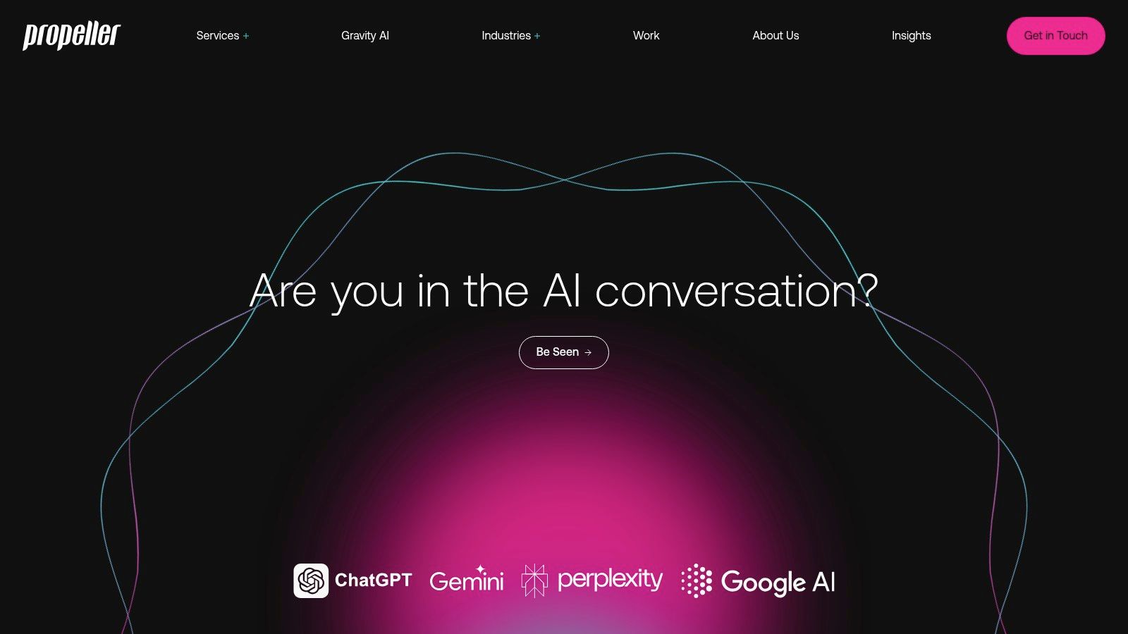
Propeller is worth studying if you sell products, run a hospitality brand, or plan to scale through e-commerce. Their site doesn't just say “we build stores”. It positions web design as part of a wider growth engine that includes UX, paid media, SEO, and conversion work after launch.
That's a stronger commercial model than the one-and-done build. E-commerce websites need tuning. Collections change. Campaigns change. Buyer behaviour changes. Agencies that understand this usually design pages with testing and optimisation in mind from the start.
What e-commerce brands should notice
Propeller's case-study presentation leans into performance thinking. That's useful because store owners don't need artistic reassurance. They need to know whether product discovery is easy, category pages make sense, and checkout friction is low.
For a practical benchmark, GOV.UK found that simplifying interfaces and reducing unnecessary steps helped users complete key tasks faster and with fewer errors, according to this summary of GOV.UK redesign lessons. Different sector, same principle. If your product page, basket, or booking flow is clunky, design polish won't save it.
- Prioritise one main action: On e-commerce landing pages, that might be shop now, add to basket, or start an order.
- Reduce avoidable steps: Extra clicks cost sales.
- Design for optimisation: Build pages so you can test headlines, layouts, and offers without rebuilding everything.
If you're planning a store or major rebuild, this article on how long it takes to build a website in the UK gives a useful reality check on timing.
Propeller is especially strong for Shopify-led businesses and growth-stage brands. If you need a non-Shopify stack or a very small brochure site, it may be more agency than you need. But for businesses that treat the website as a sales channel, not a marketing afterthought, the model is sound.
4. Hallam
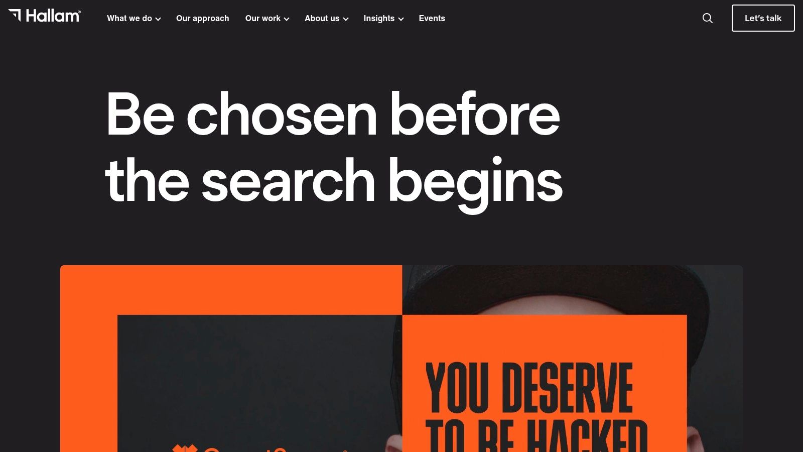
Hallam is a good example of a site that builds confidence through substance. It doesn't rely on flash to do the heavy lifting. It relies on credentials, proof, and breadth.
That's an important distinction. A lot of SME websites try to look premium without showing enough evidence. Hallam's approach is closer to how serious buyers assess suppliers. They want to know whether the team can handle design, development, media, and search under one roof.
Why proof beats polish
Hallam's strongest move is how it frames outcomes alongside capability. That gives the visitor two reasons to stay. First, they can see the agency can build. Second, they can see the build fits into a wider acquisition strategy.
This matters in the UK because online journeys now shape consumer choice in a big way, and mobile use dominates. Ofcom's 2024 Online Nation report found that 92% of UK adults were internet users, with mobile phones the most-used device for going online, according to this summary of UK website design statistics. If your page looks good on a desktop mock-up but makes mobile users work harder, your site is leaking opportunities.
Buyers trust websites that answer practical questions quickly. What do you do, who do you help, and why should I believe you?
Hallam is a smart benchmark for larger SMEs that need a joined-up digital partner. The trade-off is that broader agency structures can introduce more process and more stakeholders. That's not automatically bad. It just means you need to be sure you need the extra machinery.
If your website project also needs search, PR, media buying, and long-term campaign support, Hallam's model makes sense. If you just need a lean brochure site and local SEO basics, it may be more than required.
5. Ridgeway
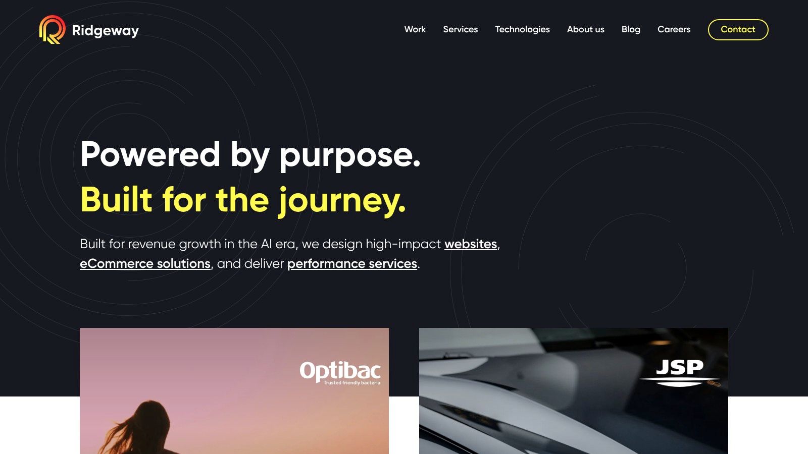
Ridgeway sits in a different category from the more brand-led studios on this list. Their site signals architecture, governance, and long-term maintainability. That matters for businesses with complex content, multiple brands, regional sites, or heavier integration needs.
If you run a smaller company, it's easy to dismiss enterprise-style agency sites as irrelevant. That's a mistake. They still teach useful lessons about structure, trust, and information architecture.
What complex businesses can learn
Ridgeway's website shows the value of designing for clarity at scale. Large content estates don't survive on style alone. They need good navigation, controlled templates, sensible hierarchy, and content models that don't collapse once more teams start using them.
That same principle applies to smaller businesses sooner than they think. A site with ten pages can feel simple. A site with services, locations, resources, case studies, careers, and campaigns gets messy fast if nobody planned the structure.
There's also a trust angle here. In sectors where compliance, accuracy, or governance matter, buyers look for signals that the site is well run. Clear navigation, stable layouts, and professional technical framing all help. Ridgeway's site does that well.
- Build for tomorrow's complexity: Don't design a navigation that only works at launch.
- Keep content patterns consistent: Reusable structures beat one-off page designs.
- Treat architecture as a sales issue: If people can't find information, they won't convert.
Ridgeway won't be the right model for a simple local business site. It is, however, a strong example of web page design for firms that need depth, control, and scalability. If your site is becoming a serious operational platform, not just a marketing surface, this is the kind of thinking to study.
6. Fortnight Studio
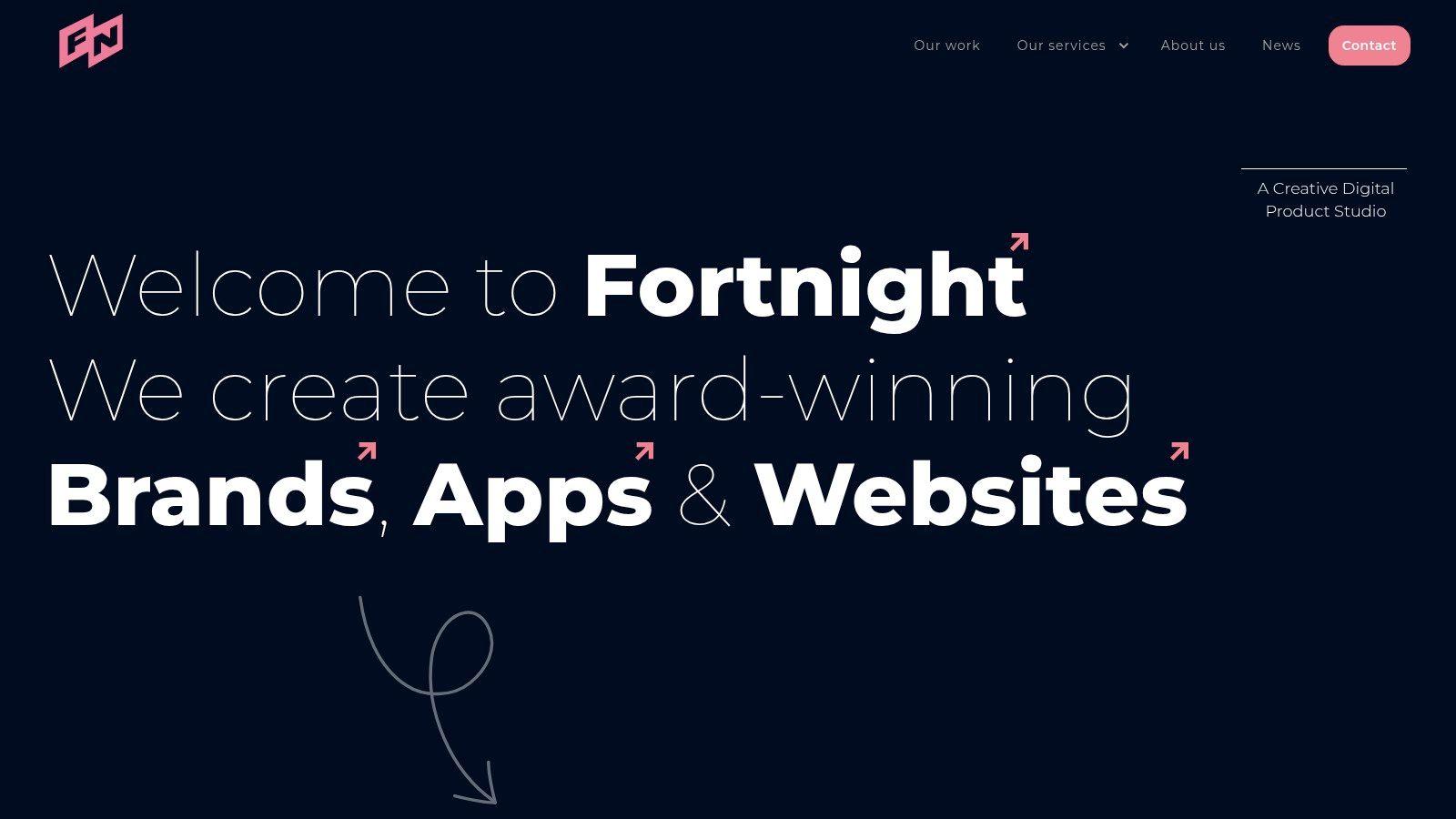
Fortnight Studio is a useful counterweight to the bigger agency model. The site feels leaner, more focused, and more product-minded. That's often a better fit for startups, founder-led firms, and SMEs that want sharp UX without enterprise overhead.
You can see that mindset in the way the work is framed. Less noise. Tighter presentation. More emphasis on systems, UX thinking, and design decisions that carry through multiple pages and components.
Why lean UX often wins
A lot of websites fail because they try to say everything at once. Fortnight's style points in the opposite direction. Stronger editing. Better spacing. More confidence in what gets left out.
That's not a small thing. In UK mobile behaviour, speed and usability are closely tied. Ofcom reported that 88% of UK adults used a smartphone in 2024, and Google says 53% of mobile visits are abandoned if a page takes longer than 3 seconds to load, according to this discussion of mobile-first web design examples. If your page is overloaded with visual clutter, long intros, and bloated assets, many visitors won't stick around.
Cleaner pages usually convert better because they remove decisions, not because they look minimal.
Fortnight is a strong reference point if you want a modern marketing site or Webflow build that stays disciplined. The main trade-off is scale. Boutique studios often offer stronger senior involvement, but they may not suit very large multi-market rollouts.
For many SMEs, that's a fair exchange. Better attention usually beats extra layers.
7. ViDesigns
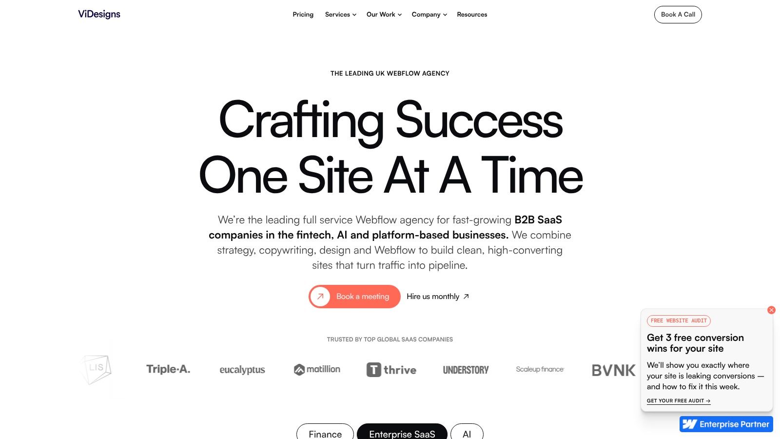
ViDesigns is a strong example for founders and marketing teams who care about speed, editing freedom, and clear scope. Their Webflow-first positioning is obvious, and the site reflects the benefits of that choice. Clean marketing pages, polished interactions, and a sense that launch speed matters.
That's often exactly what a growing business needs. Not a six-month rebuild. A site that looks credible, is easy to update, and gives internal teams enough control to keep moving.
What speed-focused buyers should copy
One of ViDesigns' smartest choices is commercial clarity. Published guide pricing and packaged options reduce friction because buyers can self-qualify early. More agencies should do this. Hidden budgets don't create better leads. They create mismatched conversations.
ViDesigns also reflects a broader shift in what buyers expect from websites. Accessibility, trust, and clarity are becoming baseline expectations across digital products, especially with the June 2025 European Accessibility Act deadline influencing design expectations, as discussed in this article on accessibility and trust in modern web design. If your site is stylish but confusing, inaccessible, or vague on key information, it won't feel current for long.
A few takeaways stand out:
- Show pricing guidance where possible: It filters bad-fit leads and builds trust.
- Use interactions with restraint: Animation should support comprehension, not perform for its own sake.
- Make editing easy: Marketing teams need to update pages without developer bottlenecks.
ViDesigns is best for projects that fit Webflow well. If you need deep server-side logic or complex custom integrations, another stack may be more suitable. But for brochure sites, B2B marketing pages, and design-led company websites, it's a solid model.
7-Agency Web Design Comparison
| Agency | 🔄 Implementation Complexity | ⚡ Resource Requirements | 📊 Expected Outcomes | 💡 Ideal Use Cases | ⭐ Key Advantages |
|---|---|---|---|---|---|
| BPE Digital | Moderate–High, bespoke builds across Webflow/WordPress/Shopify/Next.js; 6–12 week timelines | Senior-led small team; project budgets ~£6k–£20k; retainers from £950/mo | Strong measurable lifts (median +184% organic; 3.4× enquiries) | UK independents needing ROI-focused sites and asset ownership | Senior-led attention, bespoke code, clear pricing & fast delivery |
| KOTA | High, visually rich, component-based WordPress builds; ~14‑week medium projects | Premium design & motion resources; requires performance tuning | Distinctive brand experiences that qualify high‑end leads | Brand-driven sites for clients seeking premium visual direction | Powerful creative/motion work and clear end‑to‑end process |
| Propeller | Moderate–High, Shopify/Shopify Plus ecommerce focus with integrations & CRO | Shopify dev + UX + marketing/CRO resources; ecommerce budgets and ongoing optimisation | Scalable ecommerce performance and revenue growth | D2C, hospitality and CPG brands needing ecommerce + growth | Deep Shopify expertise, performance case studies, integrated post-launch services |
| Hallam | Moderate–High, full‑service, multi-discipline workflows; governance adds time | Agency-scale teams (design, dev, media, PR); ongoing acquisition resources | Full‑funnel KPI improvements (enquiries, organic growth, PR impact) | SMEs seeking site builds plus in‑house performance marketing | Awards, Google Premier Partner, strong results storytelling |
| Ridgeway | Very High, enterprise .NET/Kentico multi‑site architecture and complex integrations | Enterprise technical teams; higher budgets; long-term support & governance | Stable, secure, scalable platforms for complex organisations | Regulated/enterprise projects needing robust architecture & migrations | Deep Kentico/Xperience expertise and enterprise-grade support |
| Fortnight Studio | Low–Moderate, Webflow/product & UX‑led builds; rapid iteration and design systems | Senior designers in small teams; fast time‑to‑market resourcing | High‑quality UX and fast launches with repeatable design systems | Startups and SMEs wanting senior design and quick Webflow delivery | UX research, design systems, lean collaborative process |
| ViDesigns | Low–Moderate, Webflow‑first, productised packages and retainer models | Webflow specialists; published guide pricing and “Unlimited” retainers | Rapid, design‑accurate launches and easy in‑house editing | SMEs/founders seeking transparent pricing and Webflow builds | Pricing transparency, Webflow Enterprise Partner, productised retainers |
Your Next Steps Turning Inspiration into Action
A good example of web page design isn't just a page that looks polished in a screenshot. It's a page that makes your offer clear, earns trust quickly, and gives visitors an easy next step. That's what the best agency websites in this list get right. They don't rely on decoration to do the selling. They use hierarchy, proof, layout, and messaging to move a buyer closer to action.
There are a few patterns worth taking seriously. The strongest sites make their value proposition obvious early. They reduce friction instead of adding clever distractions. They present proof before the visitor has to hunt for it. They also design for real-world behaviour, especially on mobile. Public-sector accessibility standards in the UK require content to be perceivable, operable, understandable, and reliable, and that standard is a useful benchmark for any business site, not just government projects. If your website ignores readability, keyboard access, clear labels, or responsive layouts, it's not just untidy. It's leaving people out.
Start with your homepage. Can a first-time visitor understand what you do in a quick glance? Is there one clear primary call to action? Are you showing proof, not just claiming quality? Then look at your service pages. Are they structured around buyer questions, or around your internal jargon? Finally, test your contact or booking flow. If it feels slow, cluttered, or confusing, fix that before you spend more money driving traffic.
The right lesson from these agencies isn't “copy their style”. It's “copy their discipline”. Every section on a page should have a job. Every design choice should support credibility, clarity, or conversion. If it doesn't, remove it.
That's how you turn inspiration into a site that grows the business.
If your website looks decent but isn't bringing in enough enquiries, BPE Digital is worth a serious look. They build bespoke, conversion-focused websites for UK SMEs that need more bookings, stronger local SEO, and clearer positioning, then support growth with SEO, paid media, content, and CRO after launch.