A heat map is a visual way to show patterns across many data points, and in England alone that kind of mapping becomes especially useful when you're dealing with datasets spread across 32,844 small areas. On a website, the same idea works like a thermal camera for user behaviour, showing which parts are hot with clicks and attention and which parts are cold and ignored.
If your site looks polished but enquiries are inconsistent, heat mapping is often where the fog clears. You stop guessing whether people saw the button, reached the form, noticed the offer, or got stuck halfway through the page. Instead, you get a visual record of behaviour.
For a clinic owner, that might mean seeing that visitors never reach your treatment finance section. For a café, it might mean your menu page gets attention at the top and dead space lower down. For a trades business, it often reveals that people are trying to click things that aren't clickable, which is usually a sign your page layout is fighting user intent.
Table of Contents
- What Is a Heat Map and Why Should You Care
- How Heat Mapping Turns Clicks into Colours
- The Three Main Types of Website Heat Maps
- How Heat Maps Drive Growth for Clinics Cafés and Trades
- How to Implement Heat Mapping and Avoid Mistakes
- From Data to Decisions Your Next Steps
What Is a Heat Map and Why Should You Care
A heat map shows intensity through colour. It functions similarly to a thermal image, but for behaviour. Warmer areas signal heavier activity, cooler areas show neglect.
That matters because most business owners don't have a traffic problem first. They have a clarity problem. People are landing on the page, but something in the layout, hierarchy, wording, or placement is stopping the next step.
A good heat map turns that invisible friction into something you can see. Instead of arguing about whether the page is “clear enough”, you can see whether users click your call to action, drift toward irrelevant elements, or lose interest before the important section appears.
It's not a gimmick. It's an old analytical idea used in modern ways
Heat mapping isn't some trendy UX extra. It has deep roots in statistical graphics. One early ancestor was the 1873 ‘cartogramme’ by Toussaint Loua, which used colour to encode social statistics. Today, UK organisations such as the ONS use heat maps to show granular geographic variation, helping people spot patterns in things like service demand and population distribution at a glance, as outlined in this overview of heat maps in data visualisation.
This is the key point. Heat maps compress complexity.
Practical rule: If a table makes your eyes work, a heat map often makes the pattern obvious.
For a local business, that pattern might be digital or geographic. On a website, it helps you see where attention goes. In local demand analysis, it can show which postcodes or towns produce stronger enquiry patterns. Different application, same principle. Use colour to expose concentration.
Why business owners should care
Heat maps help answer questions standard analytics usually can't answer clearly:
- Why didn't people click? Standard analytics show low conversion. A click map can show whether the button was overlooked or unconvincing.
- Why didn't they finish reading? A scroll map can reveal whether your best content sits too low.
- Why are users confused? A movement or click pattern can show them interacting with the wrong thing.
Pretty websites don't always convert. Heat maps help you see what the page is doing in the wild.
How Heat Mapping Turns Clicks into Colours
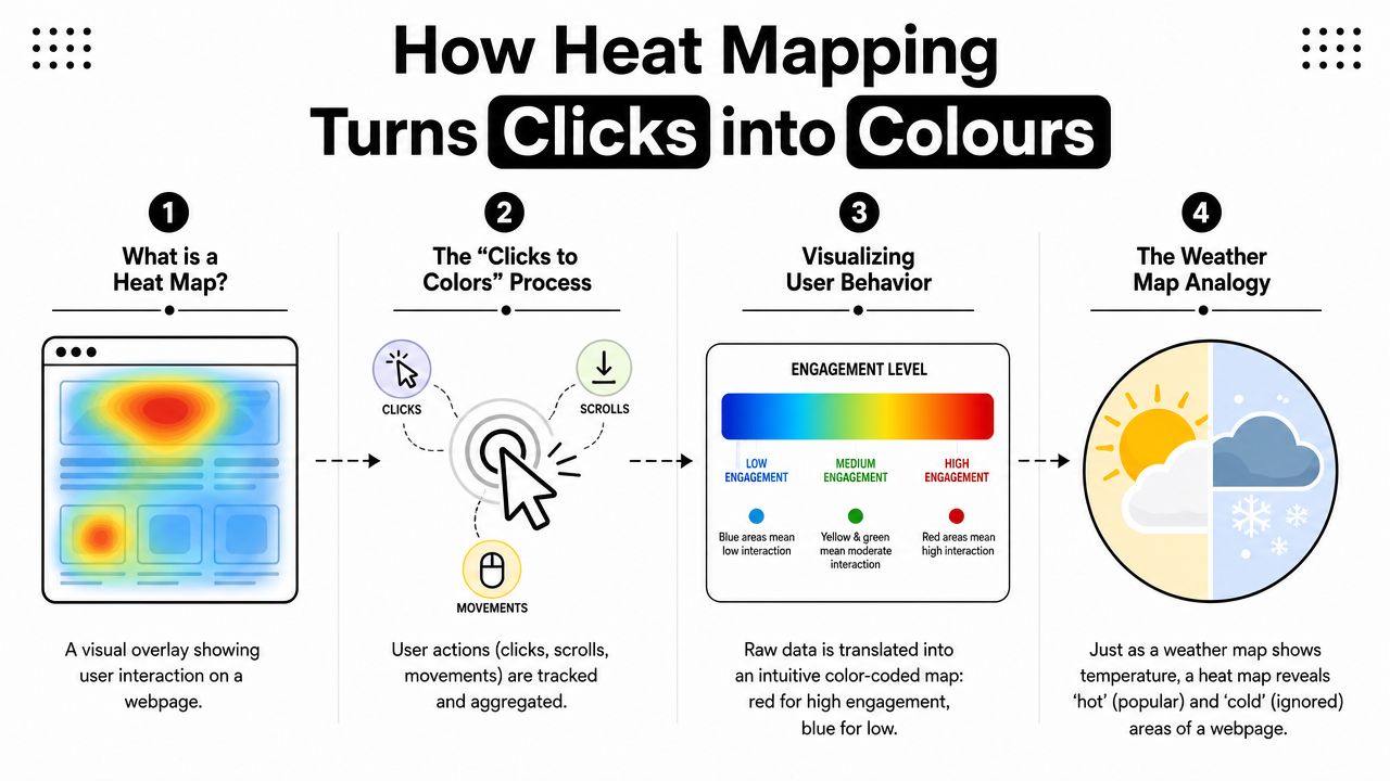
At the technical level, a heat map is a matrix-based encoding method. Each cell in a grid represents an aggregated value, and colour intensity represents magnitude, which is why it's effective for spotting hotspots, anomalies, and uneven distributions, as explained in TechTarget's definition of a heat map.
In plain English, software takes lots of user actions and compresses them into a colour layer over the page.
The process is simpler than it looks
Think of a weather map. You don't need to inspect every temperature reading from every location to know where it's hottest. The colour gradient does the heavy lifting. Heat mapping works the same way.
A visitor clicks, taps, scrolls, or moves through the page. The tool records those interactions. Then it aggregates them across many visits and overlays the pattern on the design.
The result is useful because it filters out isolated behaviour and shows concentration instead.
- Warm zones usually indicate stronger interaction or visibility.
- Cool zones usually suggest neglect, low prominence, or poor positioning.
- Unexpected hotspots often reveal confusion, especially when users click images, headings, or decorative elements that don't do anything.
What heat maps are good at, and what they're not
Heat maps are strong when you have enough behaviour to aggregate. They're weak when you try to read too much into sparse data. A few clicks in the wrong place can look dramatic if you're impatient.
That's why experienced optimisation work treats heat maps as directional evidence, not proof on their own.
A red patch tells you where something happened. It doesn't tell you why it happened.
The “why” still comes from context. Was the page loaded slowly? Was the copy weak? Was the button hidden below the fold? Was the mobile layout cramped? Heat maps help you ask better questions, and that's where their value sits.
How to read the colours properly
Don't assume every hot area is a success.
A hot navigation link may mean users are escaping the page instead of converting. A hot non-clickable image may mean the design suggests interactivity that doesn't exist. A cold contact button may mean poor placement, weak contrast, or the page not earning enough trust before asking for action.
Useful interpretation usually follows this order:
- Check the business goal first. Are you trying to drive bookings, phone calls, quote requests, or menu views?
- Find the key action area. Is it hot, warm, or cold?
- Look for distraction. Are users clustering around irrelevant elements?
- Compare with the rest of the page. A CTA isn't judged in isolation. It's judged against everything competing with it.
That's what turns colour into action.
The Three Main Types of Website Heat Maps
Not all heat maps answer the same question. That's where many businesses go wrong. They look at one visual and assume they've diagnosed the whole problem.
In practice, you usually need the right map for the right job. Tools such as Microsoft Clarity generate heat maps from aggregated clicks and scrolls, and they separate views for desktop, tablet, and mobile, which matters because interaction patterns differ by device, as shown in Microsoft's heatmaps overview.
Which Heat Map Should You Use
| Heat Map Type | What It Tracks | Best For Answering… |
|---|---|---|
| Click map | Clicks and taps on page elements | What are users trying to interact with? |
| Scroll map | How far users travel down the page | Is key content being seen? |
| Move map | Mouse movement on desktop | Where does attention appear to gather? |
Click maps
Click maps are usually the first place to look on service pages, landing pages, and forms.
They show where people click or tap. That makes them useful for evaluating buttons, navigation, image galleries, accordions, FAQs, and links embedded in content. If users repeatedly click on something that isn't interactive, the page is sending the wrong signal.
For business owners, click maps often answer questions like:
- Is the main CTA pulling attention?
- Are users trying to click trust badges, photos, or headings?
- Does mobile behaviour differ from desktop behaviour?
If your bookings page gets traffic but not action, a click map often reveals whether the issue is visibility or friction.
Scroll maps
Scroll maps tell you how much of the page people see.
Many businesses get a blunt reality check. They've spent time polishing sections that sit too low to matter. Team bios, finance information, reviews, FAQs, treatment details, or menu highlights may all be valuable, but if visitors don't reach them, they can't do any work.
If the page asks users to scroll for the payoff, the content above has to earn that scroll.
Scroll maps are especially useful for long-form landing pages, homepages, and treatment pages. They help you decide what belongs near the top, what can move lower, and what should be removed entirely.
Move maps
Move maps track cursor movement on desktop. They're less direct than clicks, but they can still be useful as a proxy for attention.
I'd treat them carefully. They're strongest when paired with click and scroll evidence. On their own, they can suggest interest without confirming action. But when users hover around pricing, financing, delivery, availability, or service areas, that often points you toward what needs clearer explanation.
A move map is often best used to spot hesitation. If users linger around a form label, service description, or fee explanation, that area may need rewriting.
How Heat Maps Drive Growth for Clinics Cafés and Trades
The practical value of heat mapping isn't the image itself. It's the decision that follows.
For UK businesses, heat mapping is also useful beyond the page level. Official datasets such as the Index of Multiple Deprivation are released for small geographic areas, including 32,844 small areas in England, which shows why heat-map style thinking is powerful for comparing local demand across many places, as noted in Wikipedia's heat map entry. That same logic can help a business understand which postcodes generate stronger enquiry intent.
A clinic page with the wrong emphasis
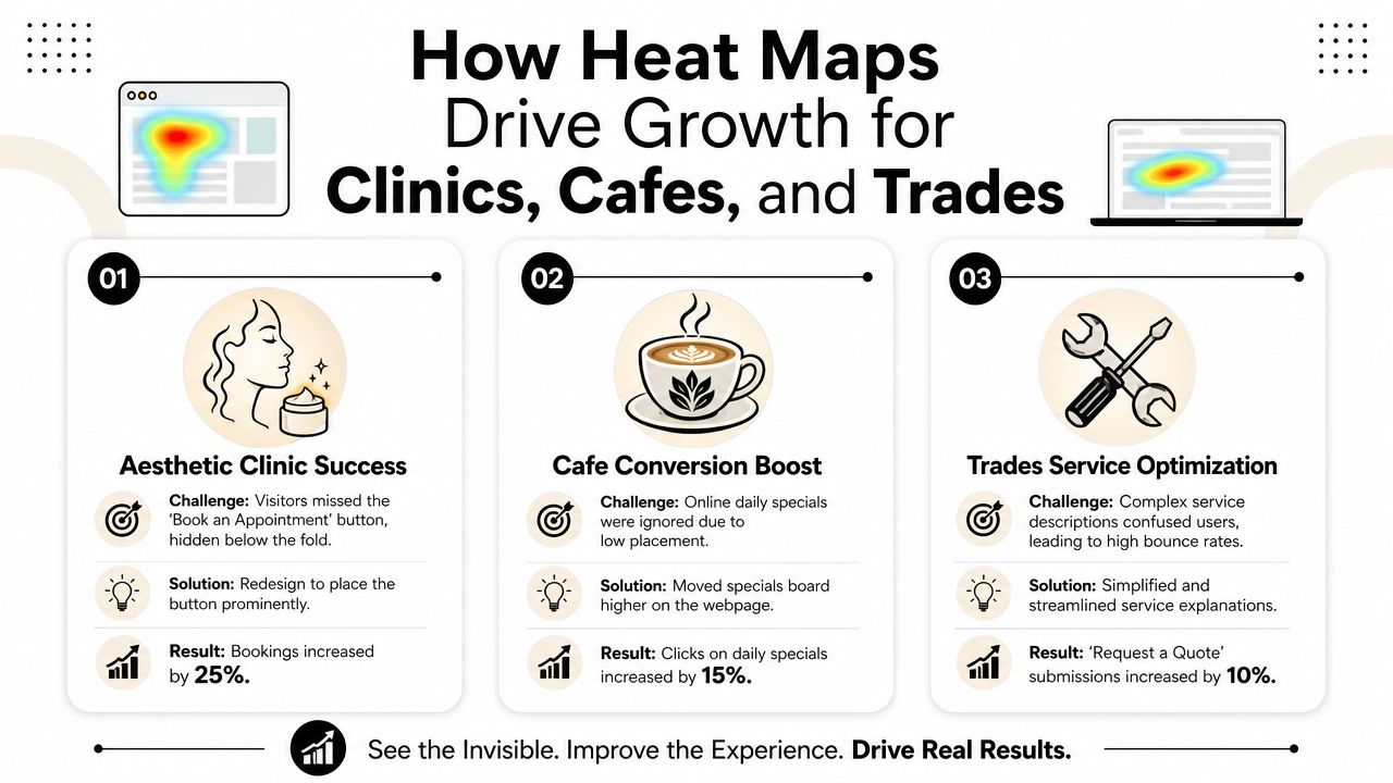
An aesthetic clinic homepage often tries to do too much at once. Before and after imagery, treatment menus, testimonials, practitioner credentials, finance options, and consultation prompts all compete for attention.
A heat map can reveal whether users notice the booking prompt or whether they drift into less commercial sections first. If the consultation button sits in a cold area, the fix usually isn't “get more traffic”. It's restructuring the page so trust and action sit closer together.
That's one reason solid website design for lead generation matters. Design isn't decoration. It's sequencing.
A café menu that hides the best bits
A café site often has one job. Get people to visit, order, or enquire about catering. But many menu pages bury profitable items below long introductions, oversized photography, or awkward category layouts.
A scroll map can show where attention fades. If visitors never reach specials, desserts, seasonal boxes, or catering information, that content may be in the wrong place. The menu isn't failing because the offer is weak. It's failing because the hierarchy hides it.
A click map can add another layer. If users tap opening times, address details, or delivery information more than menu sections, that tells you what matters most in the buying moment.
A quote form that creates friction
Trades businesses often lose leads through avoidable confusion. The form may be too long, labels may be unclear, service areas may be buried, or users may not know what happens after submission.
When people click around labels, info icons, or dead elements near the form, that usually signals uncertainty. They want reassurance but can't find it. Heat mapping won't write the fix for you, but it points straight at where the friction lives.
The best changes are often small. Clearer labels, better placement, stronger reassurance, fewer distractions.
For clinics, cafés, and trades alike, the pattern is the same. Heat maps don't create growth by themselves. They expose where your current page logic is leaking attention before that attention turns into revenue.
How to Implement Heat Mapping and Avoid Mistakes
Getting started is straightforward. Reading the results properly is where most of the value sits.
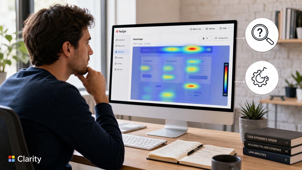
A practical first step is to install a tool such as Microsoft Clarity or Hotjar on your main commercial pages. Don't start with every page on the site. Start with the pages that drive bookings, quote requests, calls, orders, or visits.
Start small and read the right view
Pick a handful of key pages:
- Homepage: Check whether visitors move toward your primary service paths.
- Main service page: Review whether the enquiry path is obvious.
- Landing page: Test whether headline, proof, and CTA work together.
- Contact or quote page: Look for hesitation, dead clicks, and drop-off signals.
Then avoid the common mistakes.
- Don't pool all devices together. Mobile and desktop users behave differently, so compare them separately.
- Don't react to noise. A strange hotspot doesn't always mean a design flaw. Look for repeated patterns.
- Don't confuse attention with success. A hot area can indicate friction just as easily as interest.
- Don't skip the platform question. If your CMS or build setup makes testing awkward, this guide to WordPress vs Shopify vs Webflow in 2026 is useful when planning future changes.
Physical heat mapping has GDPR implications
This is the part generic heat-map articles usually ignore.
Website heat maps and physical-space heat maps are not the same thing. If you use Wi-Fi tracking, camera analytics, or in-store sensors in a clinic, café, salon, or retail environment, you're moving into privacy territory fast.
The ICO's guidance says anonymisation isn't guaranteed just because obvious identifiers are removed. Even aggregated location data can still count as personal data if there's a re-identification risk, as discussed in this overview of heat map privacy considerations.
That means physical heat mapping can trigger questions about:
- Lawful basis: Why are you collecting this data?
- Data minimisation: Are you collecting more than you need?
- Retention: How long are you keeping it?
- Transparency: Have you made the tracking clear to visitors?
- DPIA: Do you need a Data Protection Impact Assessment?
If you want a quick walkthrough of the digital side before going further, this video gives a helpful visual primer.
For brick-and-mortar SMEs, the commercial appeal is obvious. You want to understand footfall, dwell areas, queue build-up, and dead zones in the layout. But the legal side matters just as much as the insight. If you're measuring movement in a physical space, treat privacy review as part of setup, not as an afterthought.
From Data to Decisions Your Next Steps
Heat maps are diagnostic, not magical. They won't fix a weak offer, bad copy, or poor positioning on their own. What they do well is remove guesswork.
A useful way to think about what is heat mapping is this. It's a tool for forming better hypotheses. If users don't reach the booking section, move it. If they click the wrong thing, redesign the cue. If mobile users ignore a CTA that desktop users notice, adjust the layout for the smaller screen.
The biggest gains usually come from simple decisions made with confidence. Shorter pages when attention drops too early. Stronger hierarchy when users scatter. Better reassurance when forms create hesitation. Sharper content when important details sit in cold zones. If you're revisiting the messaging side as well as layout, this guide to website content that converts is a strong next read.
Heat mapping matters because it shows you what users do, not what you hope they do. That's where better enquiries start.
If you want a website that doesn't just look good but converts consistently, BPE Digital helps UK businesses turn user behaviour into better design, stronger messaging, and more enquiries. They build and improve websites for clinics, cafés, trades, and other ambitious SMEs that need performance, not just polish.